EVENT BRANDING
blackpoint lift off
Art Direction & Project Lead: Paula Rolf
Designers: Paula Rolf, Kaylee McAvoy, & Kristen Paff
-
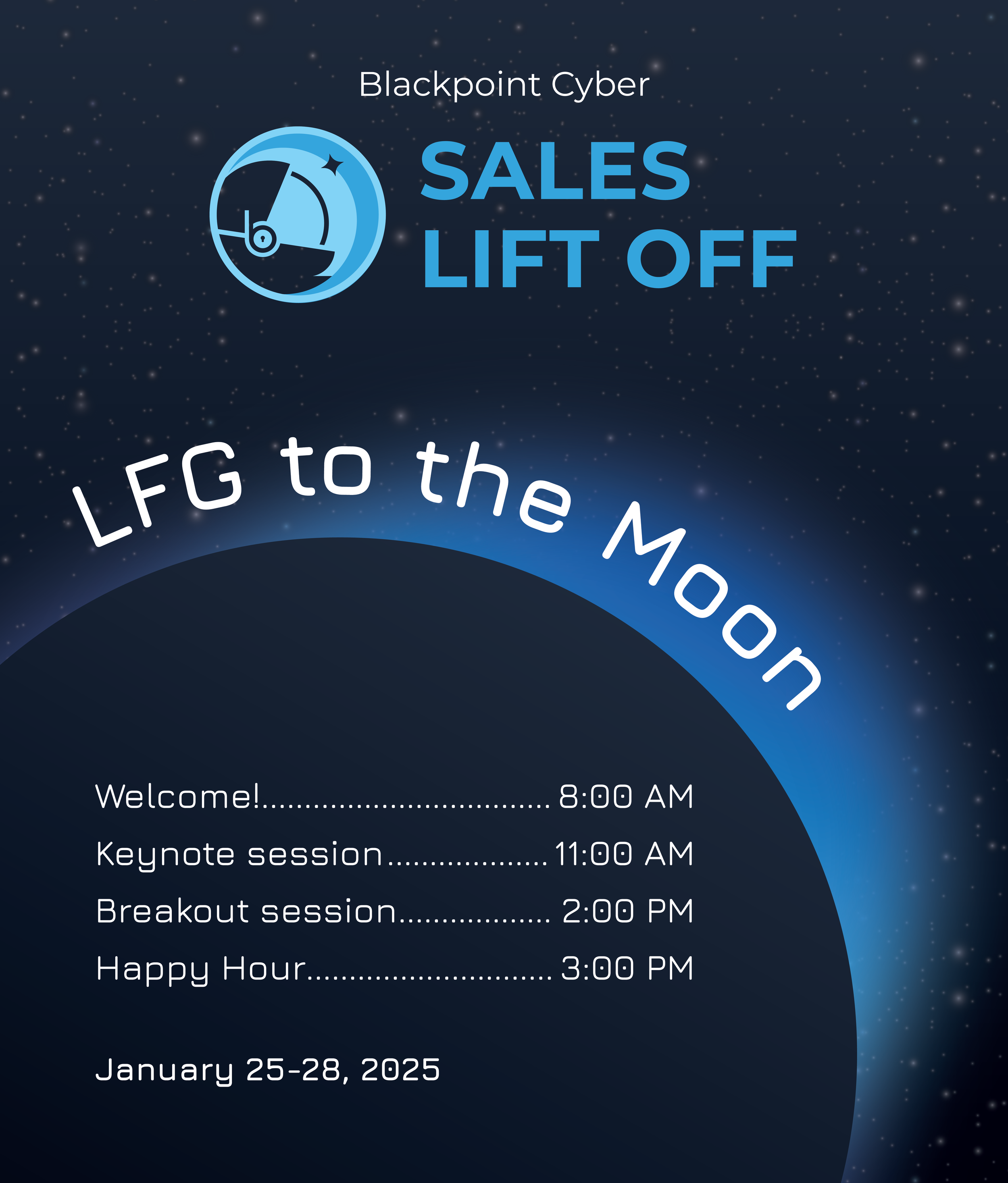
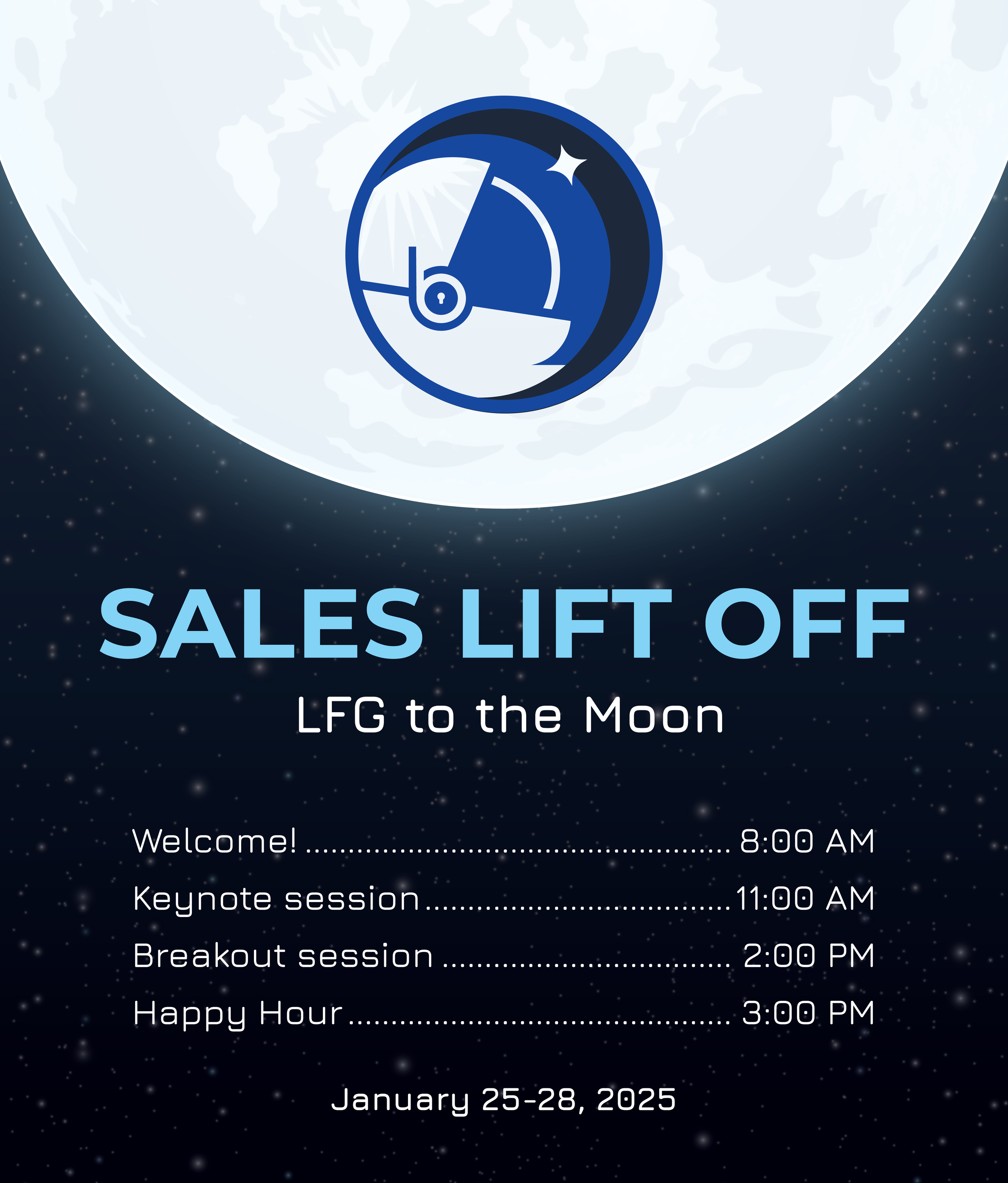
Blackpoint Cyber hosts a sales kick-off meeting every year for its sales staff to discuss current offerings and plan for the year ahead. This project focused on developing a logo and visual identity for this event that ties to the overall Blackpoint brand.
-
Create an exciting space-themed logo and event assets for Blackpoint Lift Off that feels modern and new while fitting within the existing Blackpoint brand.
-
Directed the design and creative development of the Blackpoint Lift Off event logo and assets. Responsibilities included design research, concept exploration, and developing additional assets for the event that aligned with the overall Blackpoint brand.
-
Developing a visual brand with a truncated timeline that could be implemented across a variety of assets while still fitting within the overall Blackpoint brand.
Final logo & color scheme


Brand applications
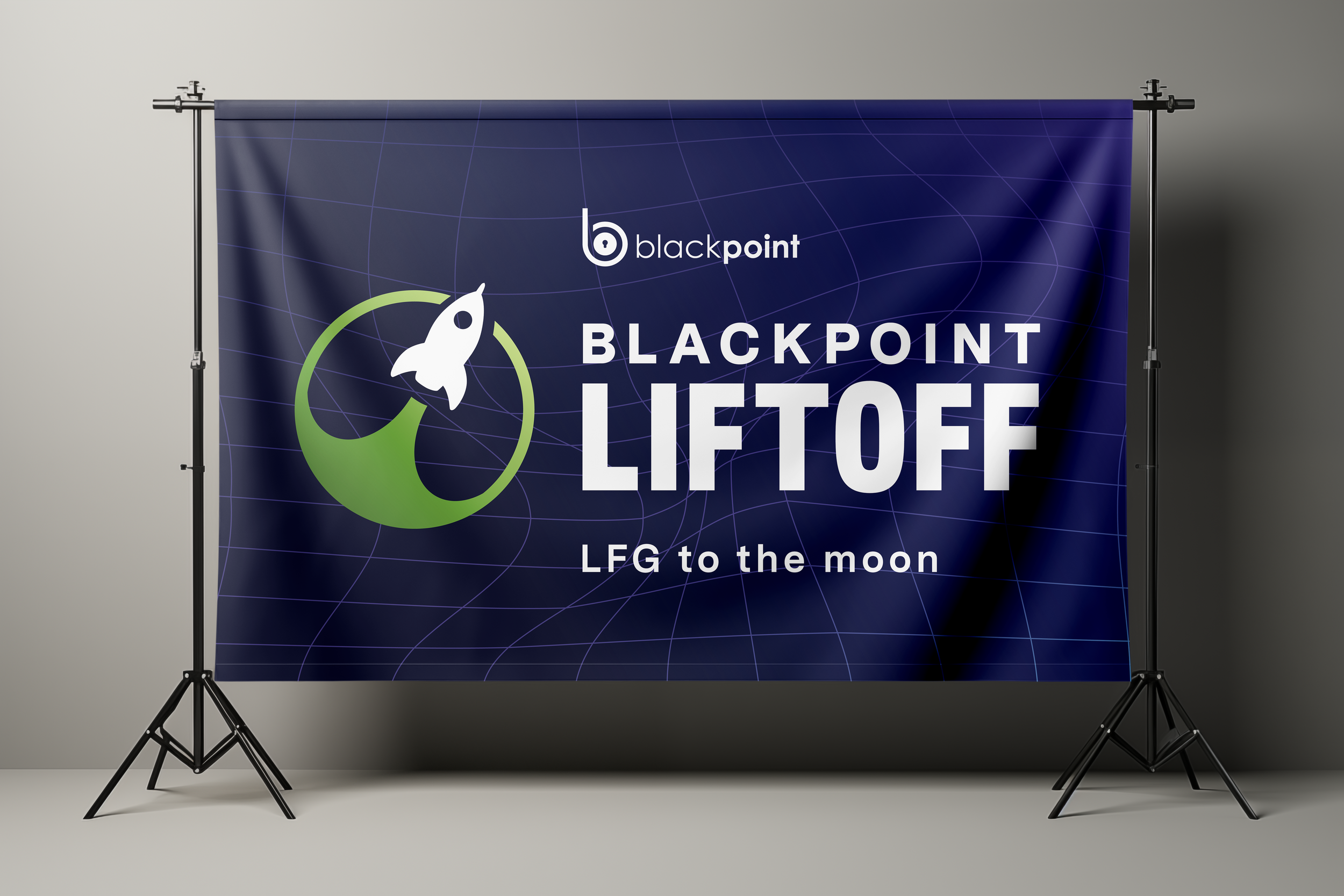
Banner
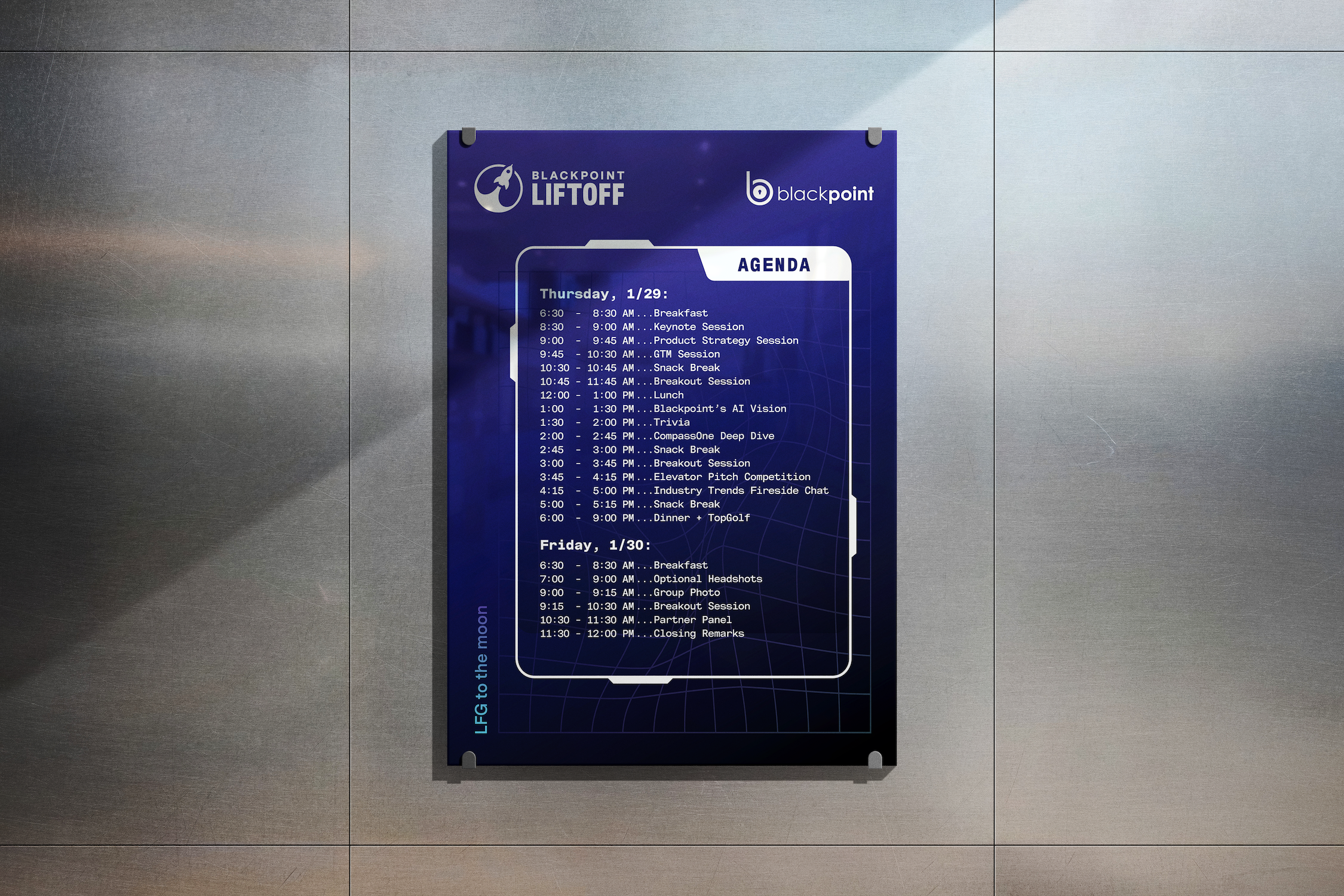
Poster with conference schedule
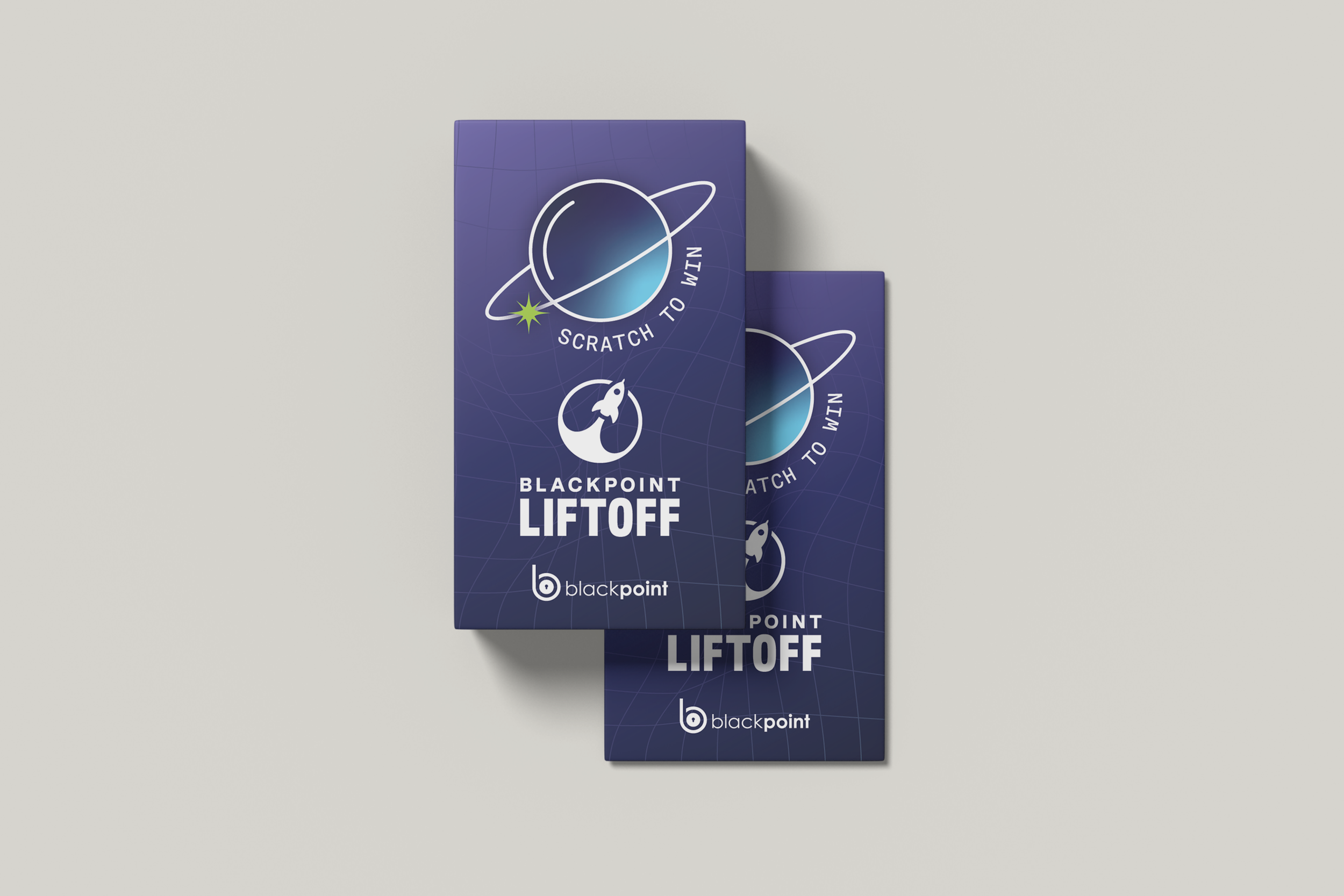
Scratch offs
Process
This brand needed to fit within the overall Blackpoint Cyber branding while fitting a space theme. It required carrying over the preexisting color scheme and typefaces. Research and concepting were essential before design to create an exciting space-theme brand. It made the overall process go faster and smoother, minimizing feedback.
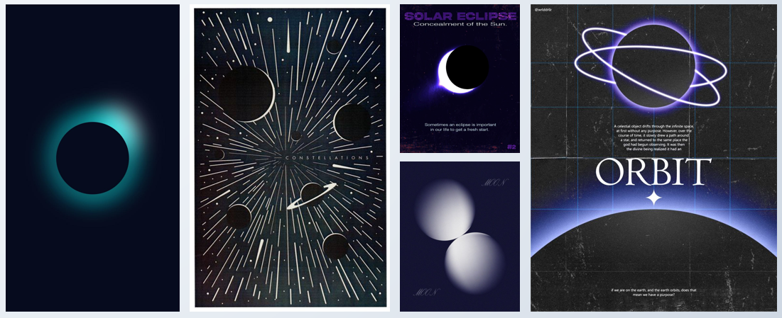
Research
In the research phase of the project, it was important to consider various design and art movements heavily influenced by outer space. This led to seeing space photos from NASA, space age and brutalist design.
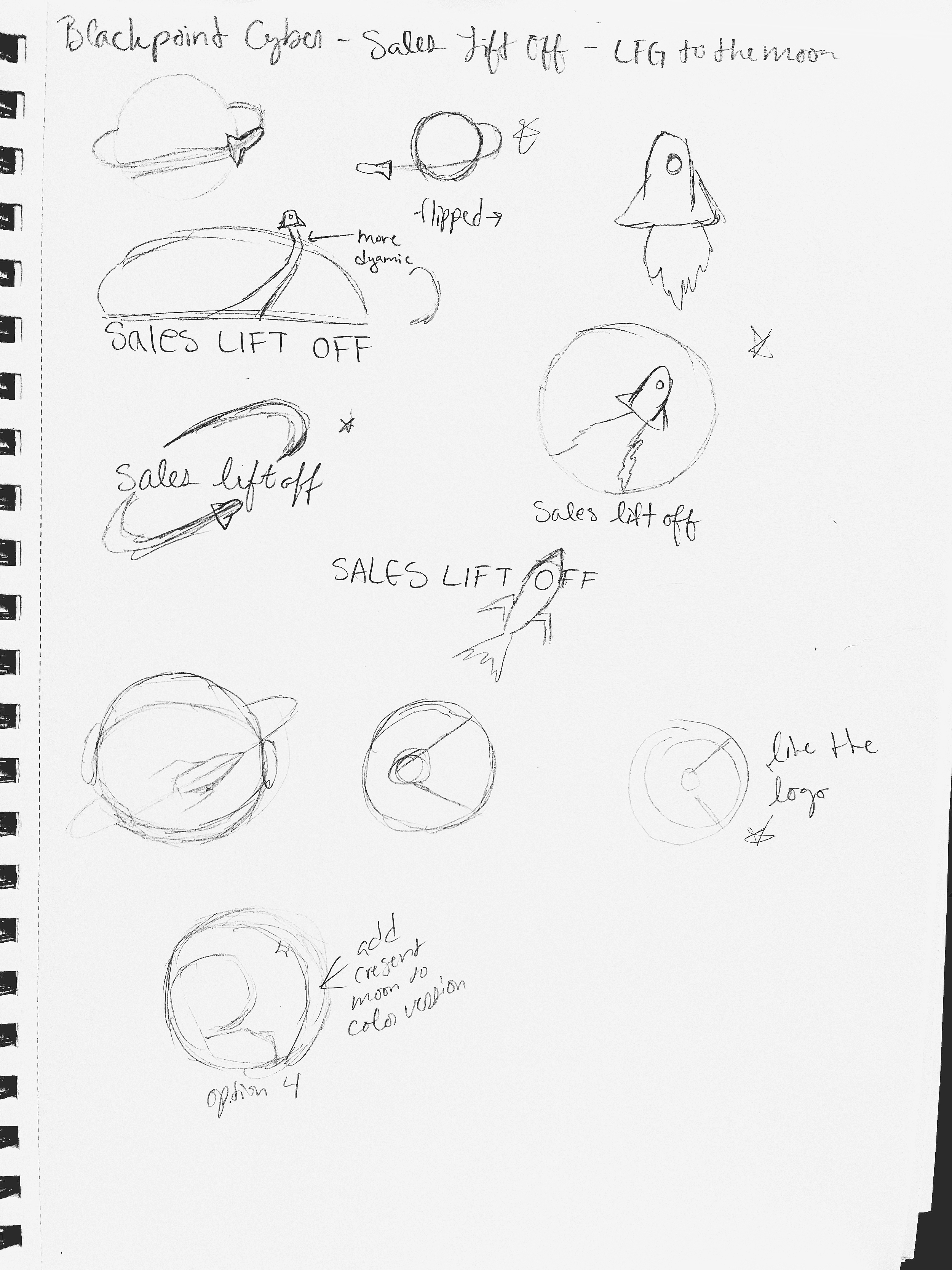
Concepting
Since the design research led towards space imagery, space age, and brutalism, that is where the concepting began. Sketching various logo and poster options helped determine the direction of this sub-brand and how it would influence the additional assets.
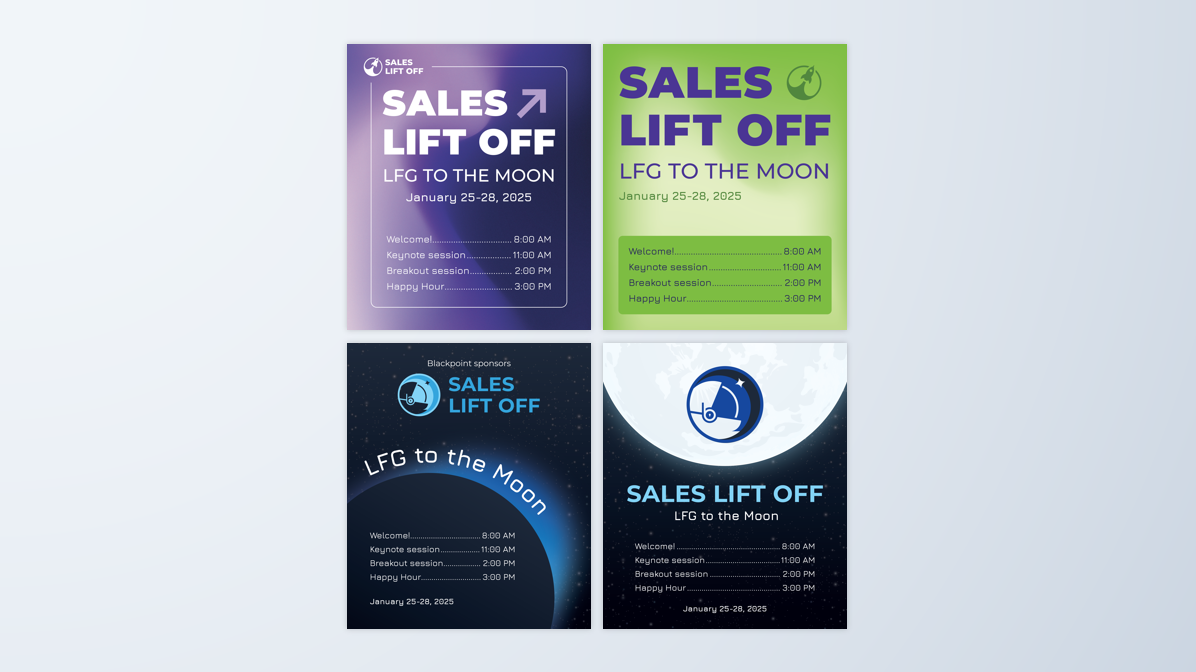
Design
The initial designs started with the logo, poster, and establishing the color scheme. Through iteration and client feedback, the brand started with a space age theme, moving toward brutalist, shown through the use of grids, geometric shapes, and a limited color scheme.
Alternate concept exploration